The ENOUGH Brand
About ENOUGH
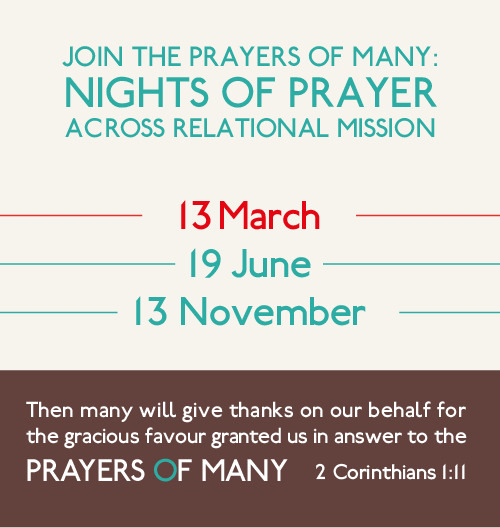
ENOUGH is an ongoing prayer initiative, where multiple churches from across the world join in pursuing a prayer agenda together.
These guidelines are intended to explain the ENOUGH branding, and to help you produce ENOUGH-branded materials for use in your local church. For any enquiries about the ENOUGH branding please contact hello@madeby.ink.
The word 'enough' carries a double meaning: a statement that we have had enough of certain situations and a statement of faith that the Lord is enough to bring about change.
The ENOUGH brand is intended to reflect these values, communicating persistence, energy and breakthrough. The brand is intended to be simple and accessible. When implemented, branded deliverables should be grounded, tactile and 'real'.
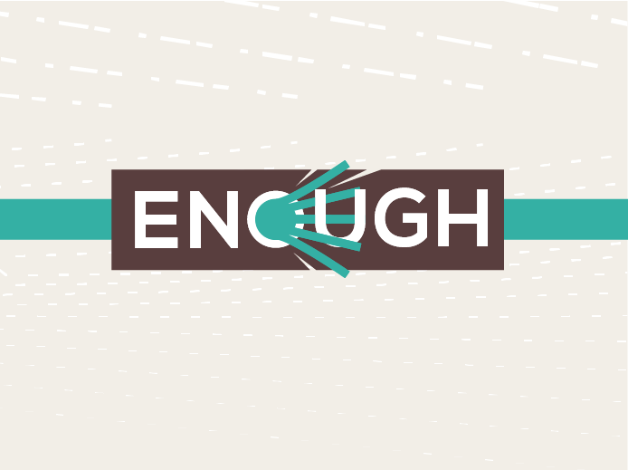
Logo
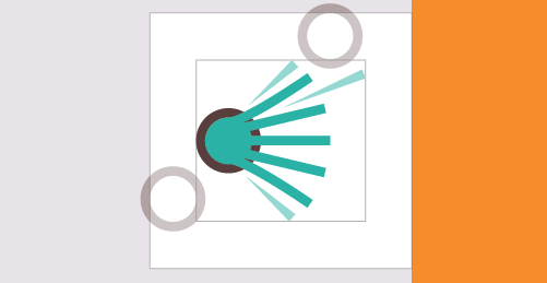
The ENOUGH logo carries an explosive energy and is intended to represent journey, persistence and breakthrough.
Primary Logo
Please use the primary logo for any deliverables which are communicating the "bigger picture" about ENOUGH.
If you are promoting (or producing material for) a specific ENOUGH event please use the event-specific version logo. More information on how to promote individual events can be found below.
Do
Scale the logo to suit your needs (but ensure it remains legible).
Do
Maintain an exclusion zone around the edges of the logo.
The size of the exclusion zone is based on the size of the 'O' within the logo.
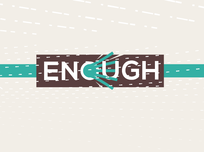
Don't
Place elements within the exclusion zone.
This is particularly important with the top/bottom of the logo.
Do
Use the ENOUGH belt element horizontally within the exclusion zone.
Don't
Use the ENOUGH belt element at any other angle.
Don't
Add extra text or graphic elements to the logo.
Don't
Apply any effects to the ENOUGH logo.
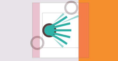
Symbol
The symbol can be used as an alternative to the primary logo.
INK suggest that the symbol should only be used when:
- avaialble horizontal space would better accommodate the symbol
- available space makes the primary logo illegible
- the uppercase word "ENOUGH" already features promimently in the deliverable
Do
Maintain an exclusion zone around the edges of the symbol.
Don't
Place elements within the exclusion zone.
Colour
Primary Palette
The Primary Palette should be your first port of call whenever you are producing ENOUGH branded materials.
Highlight
- Pantone: 7456C
- CMYK: 67,0,41,0
- Hex: #3FBFAD
Lowlight
- Pantone: 7617 C
- CMYK: 50,69,62,45
- Hex: #5A3C3D
Text
- Pantone: 412 C
- CMYK: 62,66,65,62
- Hex: #392F2C
Background
- Pantone: 663 C
- CMYK: 8,9,5,0
- Hex: #E7E1E6
Secondary Palette
You may use any of the secondary colour palette when producing ENOUGH branded materials. You may choose two colours from this palette (a highlight and a lowlight) and use that pair throughout your design. Using too many different colours looks messy and moves away from the simplicity of the ENOUGH brand values.
Please note that each ENOUGH event has a specific colour-pairing selected in advance. This pairing should be used when promoting that event. More details can be found below.
Highlights
- Pantone: 338 C
- CMYK: 16,0,96,0
- Hex: #E2E71F
- Pantone: 715 C
- CMYK: 0,54,93,0
- Hex: #FA8D29
- Pantone: 179 C
- CMYK: 4,91,91,0
- Hex: #E63C2F
- Pantone: 213 C
- CMYK: 1,98,24,0
- Hex: #EA1D76
- Pantone: 458 C
- CMYK: 16,17,81,0
- Hex: #DCC555
- Pantone: 7579 C
- CMYK: 7,80,98,1
- Hex: #E15829
- Pantone: 306 C
- CMYK: 81,3,5,0
- Hex: #00B3E3
Lowlights
- Pantone: 7689 C
- CMYK: 78,33,8,0
- Hex: #288DC1
- Pantone: BLUE 072 C
- CMYK: 100,98,2,3
- Hex: #060E9F
- Pantone: 7617
- CMYK: 50,69,62,45
- Hex: #5A3C3D
- Pantone: 7435 C
- CMYK: 37,96,49,22
- Hex: #8B254F
- Pantone: 2756 C
- CMYK: 100,93,0,23
- Hex: #131F6B
- Pantone: 412 C
- CMYK: 62,66,65,62
- Hex: #392F2C
- Pantone: BLACK 5 C
- CMYK: 58,72,60,60
- Hex: #3F2B2F
Typography
Railway
Railway is the primary font used on ENOUGH branded mateirals. It is typically used for both headings and body text.
The font is free to download from FontSquirrel.
Do
Use the Railway font to carry your main body text.
Don't
Use other display fonts unless absolutely necessary.
Do
Scale Railway to suggest hierarchy.
Don't
Use faux-bold, or otherwise manipulate the typeface.
Do
Use Railway for headings as well as for body text.
Don't
Use other stylised fonts when producing ENOUGH branded materials.
Leander
Leander is a secondary font also used on ENOUGH branded materials.
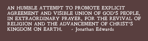
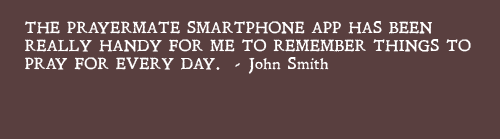
As ENOUGH draws inspiration from historic movements of prayer, inspirational quotes are often used in ENOUGH materials. The use of this font is reserved for usage with historic quotes.
The font is free to download from FontSquirrel.
Do
Use Leander for pull-quotes.
Don't
Use Leander for headings or body copy.
Do
Use Leander in historic quotes.
Don't
Use Leander for recent/modern quotes.
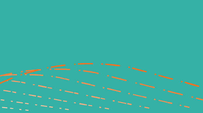
Texture and Pattern
The ENOUGH brand is intended to be tactile. Ideally materials should be printed onto weighty or textured paper or even brown card (see Print Guidelines for more details). However, we do appreciate that this is not always practical!
When printing onto finished or less tactile materials designers should make use background colours and the ENOUGH pattern.
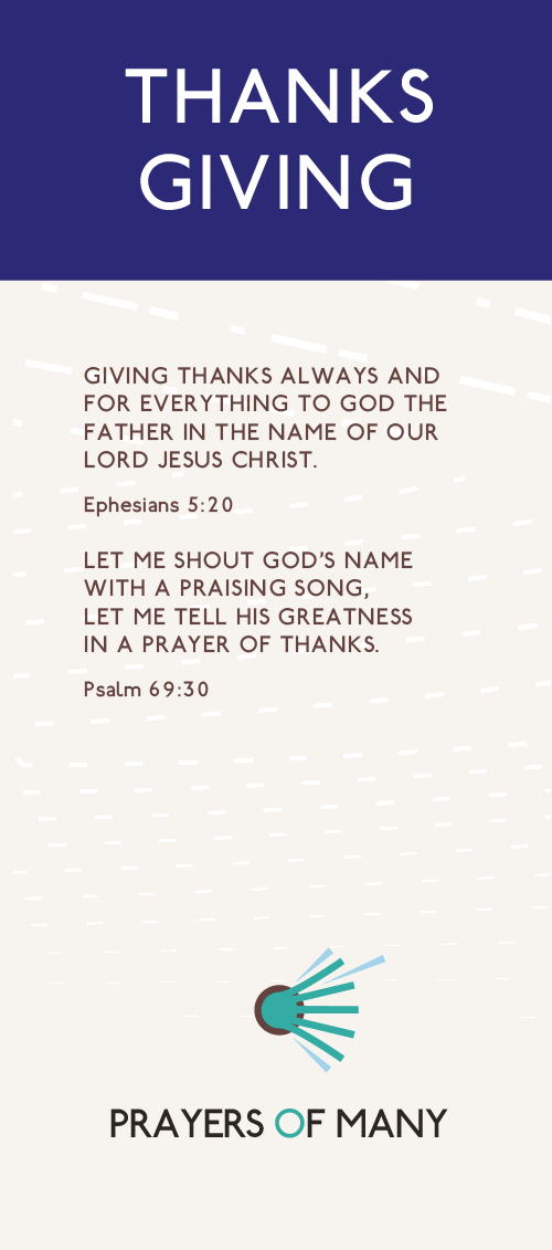
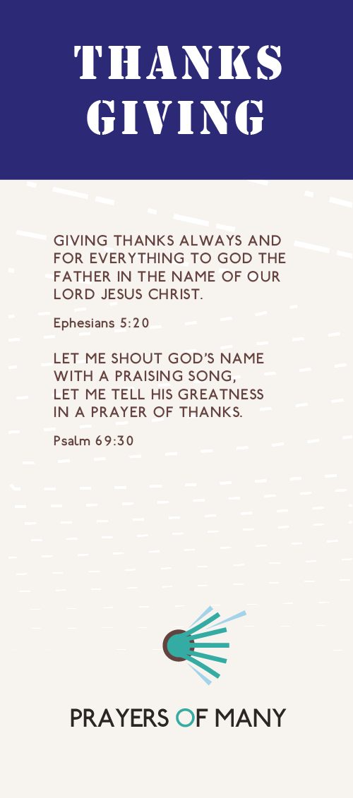
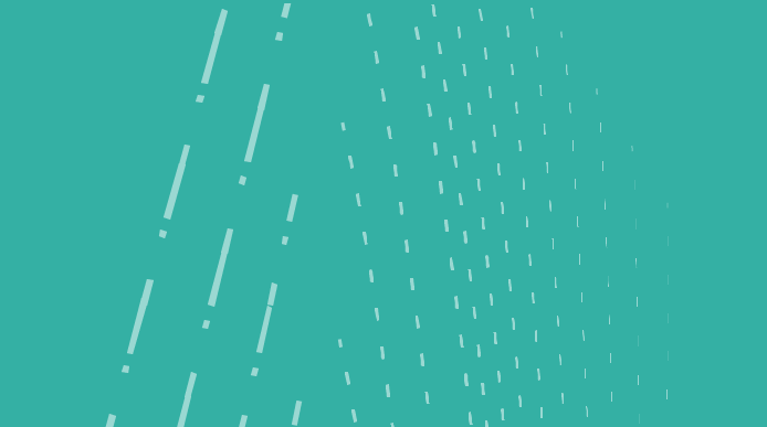
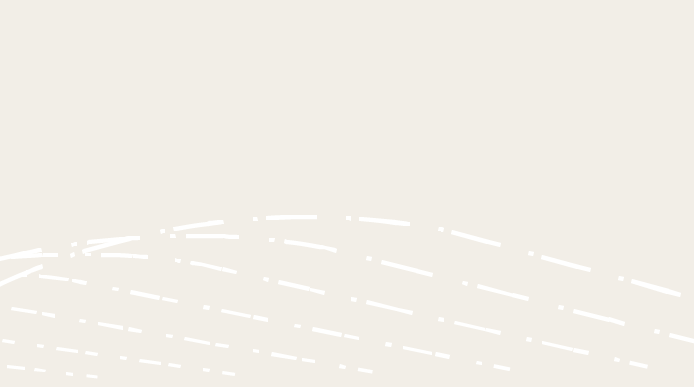
The ENOUGH pattern is designed to communicate persistent prayer and the passage of time. As such, it is intended to flow horizontally. The individual marks represent individual prayers, with the broader pattern representing the prayers of many.
Do
Use the pattern as a background element.
Don't
Overlay patterns across content.
Do
Crop the pattern in interesting ways.
Allow it to flow from the edge of the material.
Don't
Show the entire pattern, or attempt to contain it.
Do
Allow the entire pattern to flow horizontally.
Don't
Rotate the pattern so that it flows vertically.
Do
Use the pattern to add background texture and atmosphere to a design.
Don't
Use the pattern as a foreground element.
Use bright, contrasting colours that bring the element to the fore.
Print Guidance
Texture is an important element of the ENOUGH brand.
As ENOUGH is about making prayer accessible and 'everyday' we would encourage you to choose materials that are earthy and unfinished, rather than glossy or refined.
When we print postcards we like the 380mic pulp from SoloPress.
The ENOUGH Event Cycle
Each ENOUGH event will come with its own "asset pack". This will include all of the materials you need to start promoting an ENOUGH event. The lastest asset packs will always be available on this website.
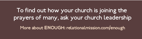
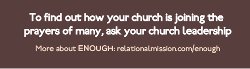
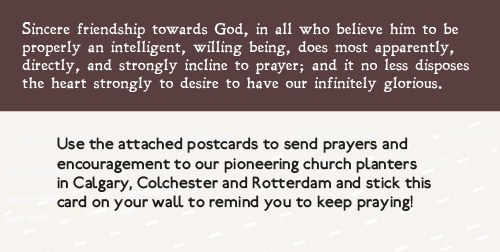
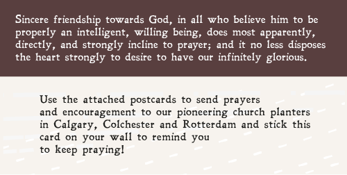
To help get you started, each pack will contain a postcard design ready to be sent off to print. It will have a space on the back allowing you to customise it yourself -- perhaps with an address label or by hand.
For graphic designers we will also be supplying the Adobe source file for this postcard. You can modify this file as heavily as you wish to create a customised version of the postcard.
All of the individual assets used to produce the postcard will also be supplied in the asset pack. This enables you to start entirely from scratch if you so desire -- but please be careful to work within the ENOUGH brand guidelines.
Colour
Each event will be given a specific colour combination from the ENOUGH Secondary Palette. Please make sure that you use these colours when promoting the event.
If this is not possible for some reason, please stick to the ENOUGH Primary Palette.
Each event will be given a specific colour combination from the ENOUGH Secondary Palette. Your asset pack will contain a version of the ENOUGH logo recoloured to use these event-specific colours.
Please try to use the correctly coloured logo when promoting an event... and feel free to use it on the night as well. If this is not possible for some reason, please stick to the ENOUGH Primary Colours - it is better to do this than use the incorrect colour-pairing.
ENOUGH Event Asset Packs
ENOUGH July 2017
The asset pack for this event can be found HERE.
This pack includes a recoloured logo, postcard and PowerPoint templates and a video top/tail, as well as a full range of individual assets.
The colour pairing for this event is:
- Pantone: 213 C
- CMYK: 1, 98, 24, 0
- Hex: #EA1D76
- Pantone: 2756 C
- CMYK: 100,93,0,23
- Hex: #131F6B
If you're planning on implementing your own materials for this event, please familiarise yourself with the ENOUGH brand guidelines and the event-specific guidance above.
ARCHIVED: ENOUGH March 2017
The asset pack for this event can be found HERE.
This pack includes a recoloured logo, postcard and PowerPoint templates and a video top/tail, as well as a full range of individual assets.
The colour pairing for this event is:
- Pantone: 338 C
- CMYK: 16,0,96,0
- Hex: #E2E71F
- Pantone: 2756 C
- CMYK: 100,93,0,23
- Hex: #131F6B
If you're planning on implementing your own materials for this event, please familiarise yourself with the ENOUGH brand guidelines and the event-specific guidance above.
ARCHIVED: ENOUGH November 2016
The asset pack for this event can be found HERE.
This pack includes a recoloured logo, postcard and PowerPoint templates and a video top/tail, as well as a full range of individual assets.
The colour pairing for this event is:
- Pantone: 179 C
- CMYK: 4,91,91,0
- Hex: #E63C2F
- Pantone: 7617
- CMYK: 50,69,62,45
- Hex: #5A3C3D
If you're planning on implementing your own materials for this event, please familiarise yourself with the ENOUGH brand guidelines and the event-specific guidance above.
ARCHIVED: ENOUGH March 2016
The asset pack for this event can be found HERE.
This pack includes a recoloured logo, postcard and PowerPoint templates and a video top/tail, as well as a full range of individual assets.
The theme for this ENOUGH event is 'back to basics'. As churches outside of Relational Mission join for the first time, this event will focus on the roots, purpose and vision of ENOUGH.
The colour pairing for this event is:
- Pantone: 306 C
- CMYK: 81,3,5,0
- Hex: #00B3E3
- Pantone: 412 C
- CMYK: 62,66,65,62
- Hex: #392F2C
If you're planning on implementing your own materials for this event, please familiarise yourself with the ENOUGH brand guidelines and the event-specific guidance above.